November 24, 201510 yr New color scheme and everything. If you ask me, this is a BIG improvement. Louisville Bats unveil new logos and uniforms | Louisville Bats News LOUISVILLE, Ky. - The Louisville Bats unveiled new logos and uniforms to be used for the 2016 season and beyond Monday afternoon at Louisville Slugger Field. Louisville Mayor Greg Fischer and Bats majority owners Stuart and Jerry Katzoff were on hand for the announcements revealing the first significant image change for the organization since before the 2002 season when the team shortened its name from "RiverBats" to "Bats." "Louisville loves the Bats, and Louisville loves tradition. But in baseball, a changeup now and again is a good thing, and we're excited about this one," said Mayor Fischer. "I expect this will reinvigorate interest in the team, get even more people to games and draw even more people to our downtown. That's a win." The new logos feature a red and navy color scheme that celebrates the great baseball tradition of previous Louisville baseball franchises that also used the colors. The prominent use of red also signifies Louisville as the players' final stop before joining the Cincinnati Reds in the Major Leagues. The Bats' name is derived from both Hillerich & Bradsby's rich history of producing baseball's finest bats in Louisville and the winged mammal found prominently in the region, each of which are featured in the new look.
November 24, 201510 yr I really, really like the new colors and new logo. I didn't HATE the previous version, but I didn't LOVE it either.
November 24, 201510 yr Author I think the LB on the hats leaves a bit to be desired - if I were calling the shots I'd put one of the actual images of the bat on the hat, but overall, I call it a big improvement...especially as far as the color scheme is concerned. And I realize it's kind of an homage to St. Louis, but I think those away unis are SHARP!
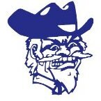
November 24, 201510 yr We're all still trying to catch up to the logo greatness that is the Frisco Rough Riders...
November 24, 201510 yr Author We're all still trying to catch up to the logo greatness that is the Frisco Rough Riders... [ATTACH=CONFIG]53398[/ATTACH] Easily in the top 5 logos of the minor leagues.
November 24, 201510 yr Author Louisville Redbirds (1982-1997) 1982 through 1984 1985 through 1988 1989 through 1997
November 24, 201510 yr To be honest, I never really liked the bats logo they've been sporting for the past few years, although I did like the away "L" with batwing. I actually liked the old bat holding bat logo they had with the purple and green unis (I was not a fan of the purple and green). I like the new ones, and agree with CWB that one of the actual "bat" logos should be used on a cap or uni.
November 24, 201510 yr And I had done so well with the mental block I'd managed to put over the section of my memory that had those sleeveless uniforms in it...
November 24, 201510 yr I think the unis are sweet. The logo, not so much. I think the whole premise should be built upon the L Slugger factory and that heritage, not a fan of using a 8 oz echolocator afraid of daylight as a mascot. Maybe just me. Makes the mudhens seem masculine.
November 24, 201510 yr I think the unis are sweet. The logo, not so much. I think the whole premise should be built upon the L Slugger factory and that heritage, not a fan of using a 8 oz echolocator afraid of daylight as a mascot. Maybe just me. Makes the mudhens seem masculine. They're a naming sponsor of the stadium, but I'd bet they have trouble dealing with licensing and intellectual property issues if they pushed it too much further. Especially now that Hillerich and Bradsby is owned by an international sporting good conglomerate instead of a local family.
November 24, 201510 yr They're a naming sponsor of the stadium, but I'd bet they have trouble dealing with licensing and intellectual property issues if they pushed it too much further. Especially now that Hillerich and Bradsby is owned by an international sporting good conglomerate instead of a local family.Oh, that's just legal mumbo jumbo.:lol2:
Archived
This topic is now archived and is closed to further replies.